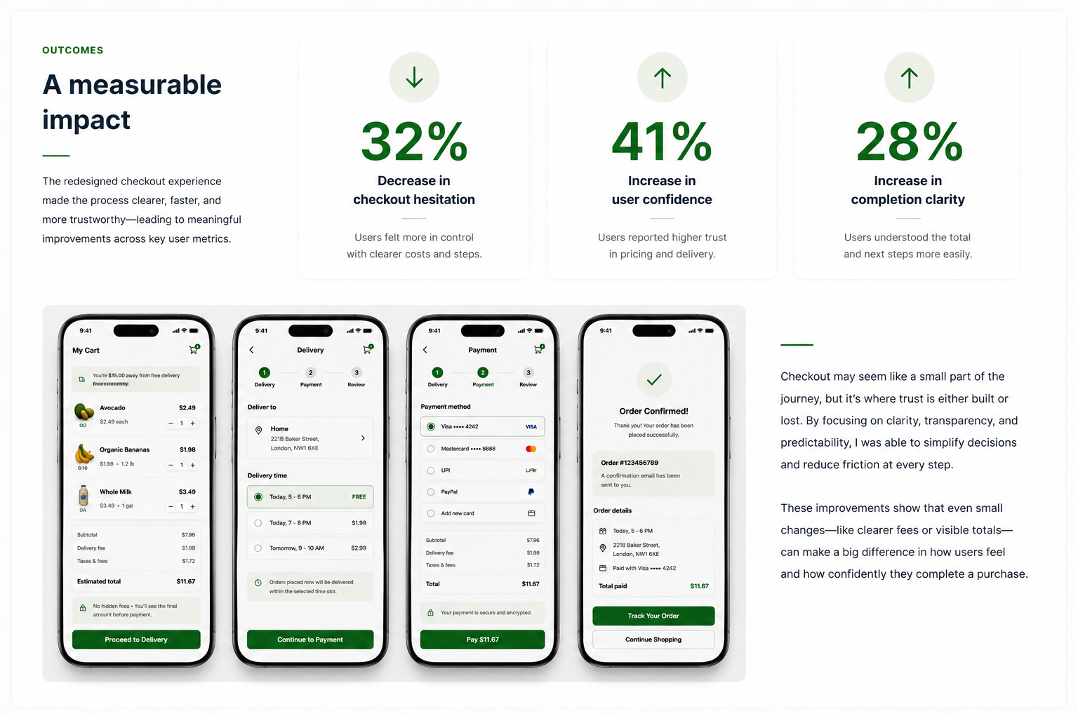
Redesigning grocery checkout for clarity and confidence
A more transparent, guided, and user-friendly checkout experience that reduces uncertainty and cart abandonment.
A transparent checkout from cart to completed order
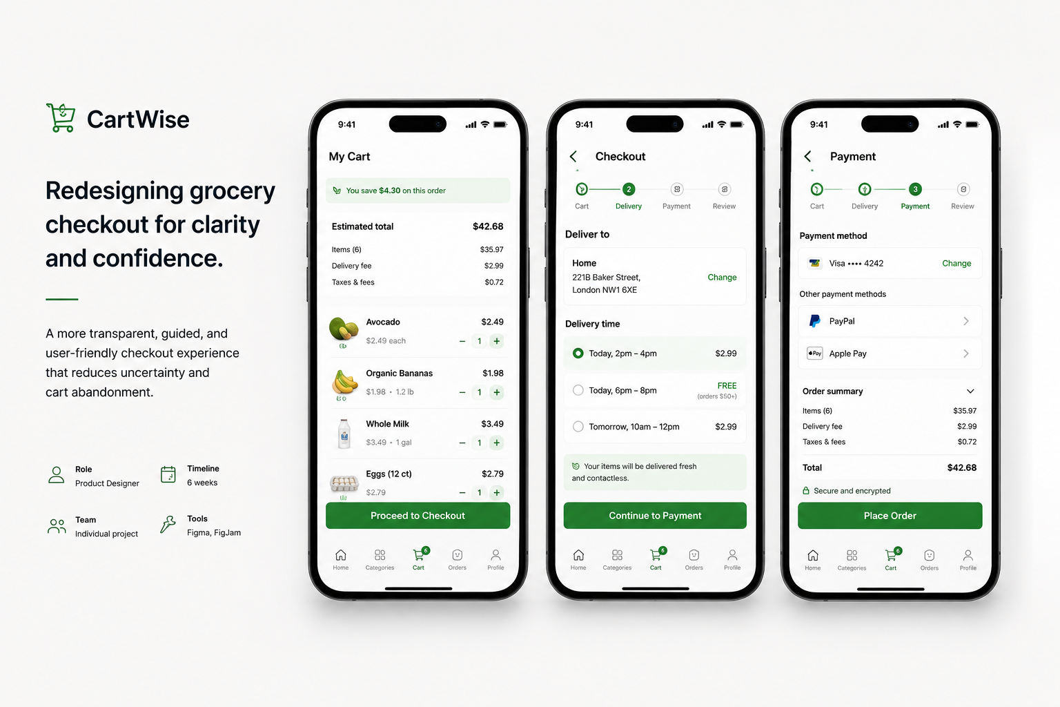
CartWise helps shoppers understand the full cost early, follow a guided checkout flow, and complete purchases with confidence. The redesign centers on price clarity, a predictable sequence of steps, trust at payment, and the ability to save or resume.
The four-part journey makes the checkout visible: Cart, Checkout, Payment, and Order Confirmed. Fees and totals are surfaced before the final step rather than appearing as surprises.
Checkout friction leads to abandoned purchases
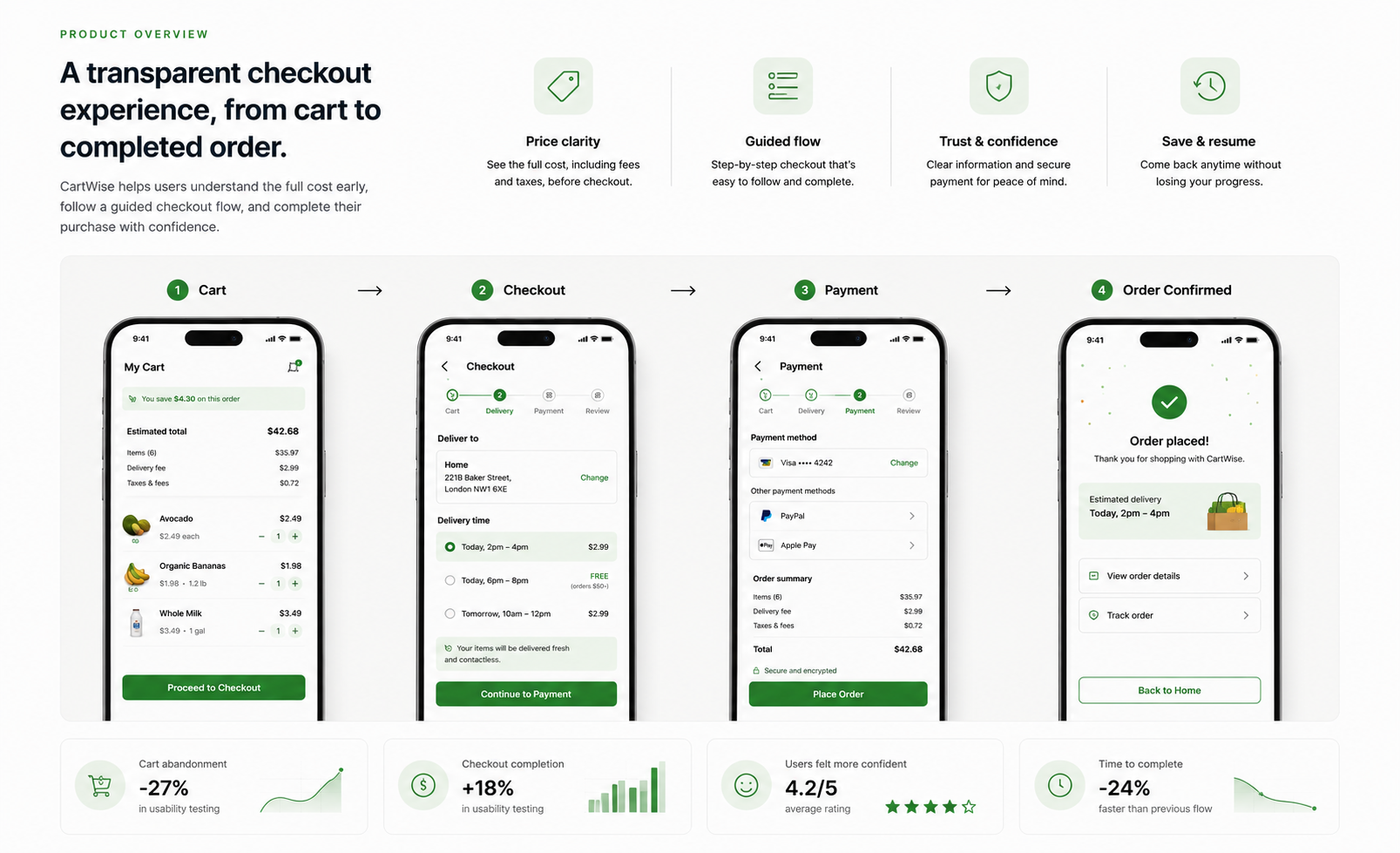
Research and user interviews identified the checkout as a major drop-off point in online grocery shopping. Unexpected costs, too many steps, unclear delivery information, and low confidence before payment increased friction.
The original case-study board reports 70% abandoning carts because of unexpected costs, 48% leaving due to a long or complicated flow, and 34% lacking confidence before payment. These are figures shown in the supplied project presentation.
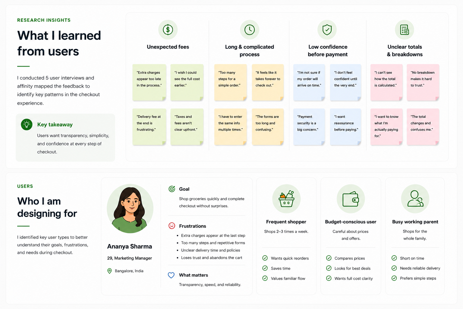
What five interviews revealed
The project included five user interviews and an affinity-mapping exercise. Feedback clustered around four recurring needs: upfront fees, fewer repeated inputs, clear payment reassurance, and a transparent total breakdown.
The design considered the needs of frequent shoppers, budget-conscious users, and busy working parents. The presented persona, Ananya Sharma, values speed, reliability, and a checkout without surprises.
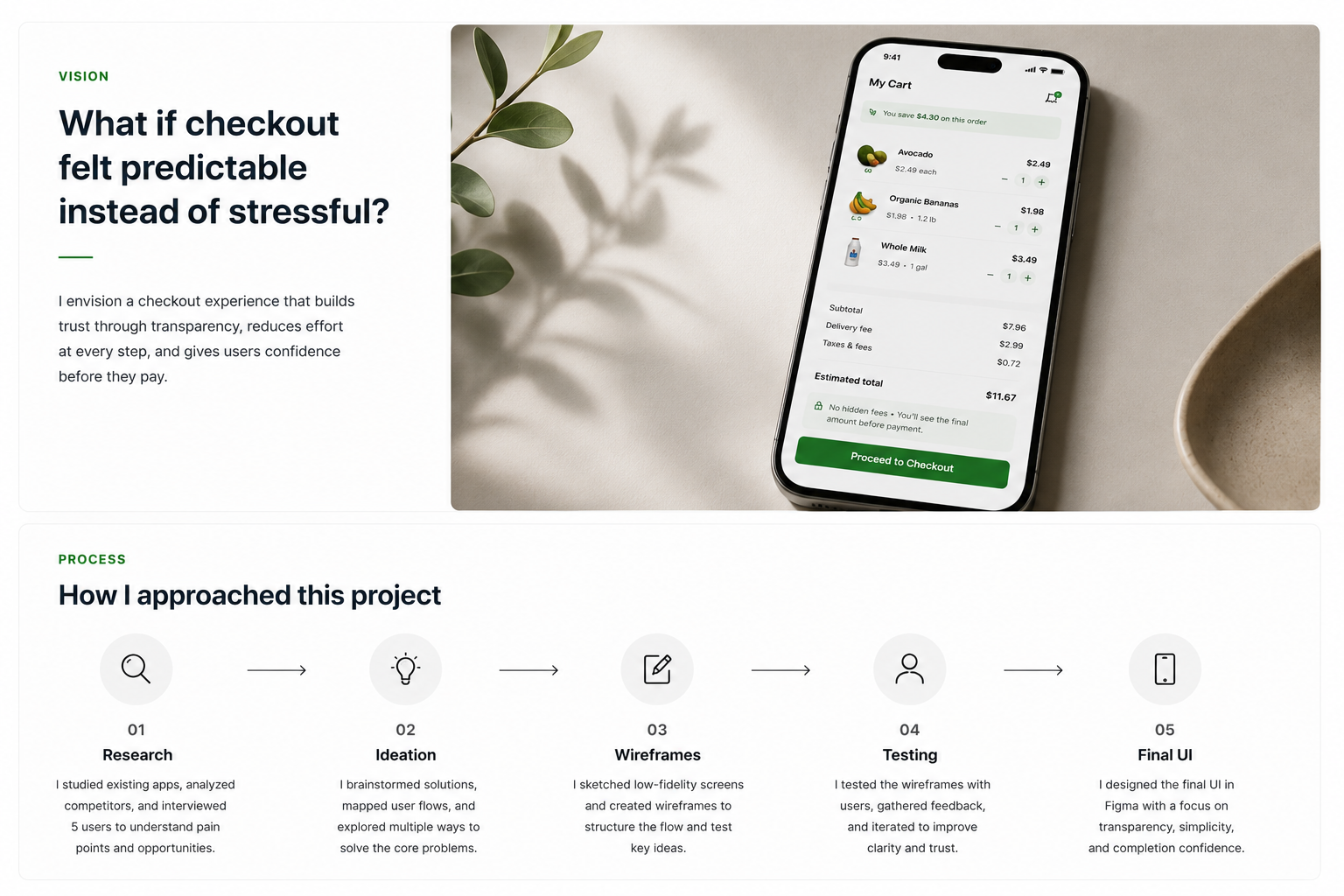
What if checkout felt predictable instead of stressful?
The vision was to build trust through transparency, reduce effort at each step, and help users feel confident before paying.
The work moved through research, ideation, wireframes, testing, and final UI. Early studies of existing apps and interviews informed sketches of different totals placements, step sequences, and checkout summaries.
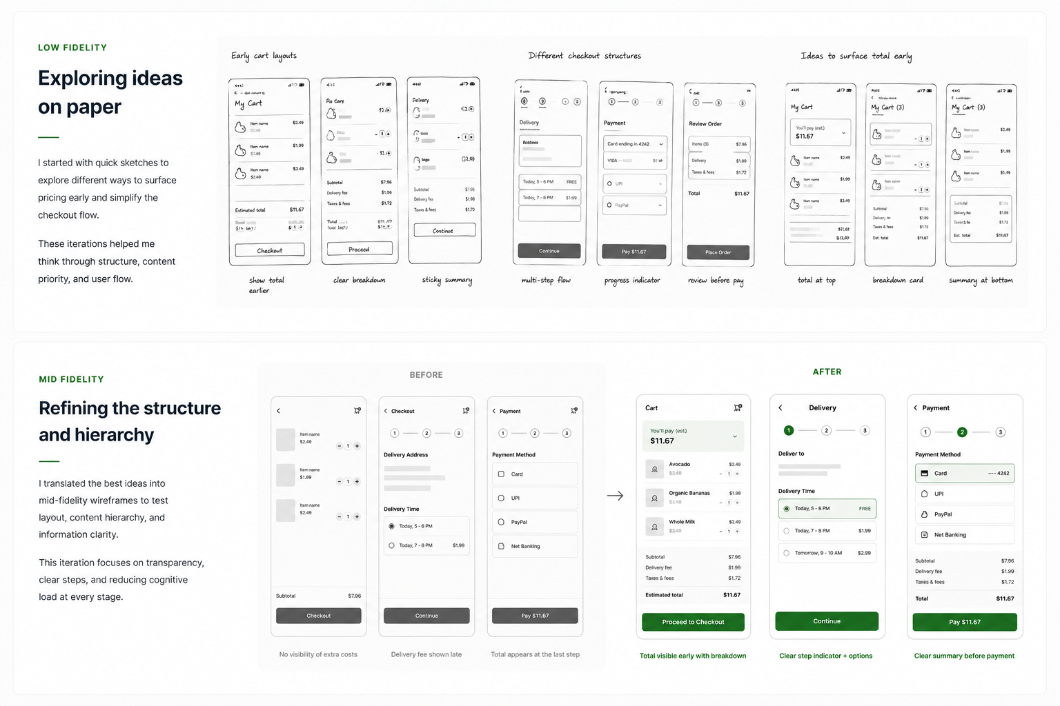
Exploring layouts before committing to a direction
Early sketches tested multiple approaches to surfacing costs, from totals at the top of the cart to a sticky summary and a breakdown card.
The checkout concepts also compared step-by-step sequencing, progress indicators, and review-before-payment layouts. The goal at this stage was to establish the content hierarchy before refining the visual design.
Refining structure and information hierarchy
The mid-fidelity comparison shows how the flow changed. Previously, extra charges were difficult to see early, delivery fees appeared late, and the total was only clear at the last step.
The refined wireframes prioritize early total visibility with a breakdown, clearer delivery choices, and a visible progress indicator. These changes address the friction uncovered during research.
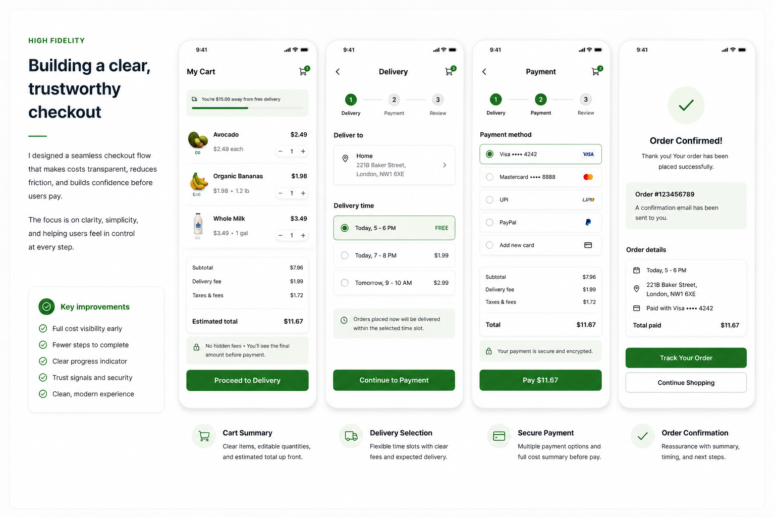
Building a clear, trustworthy checkout
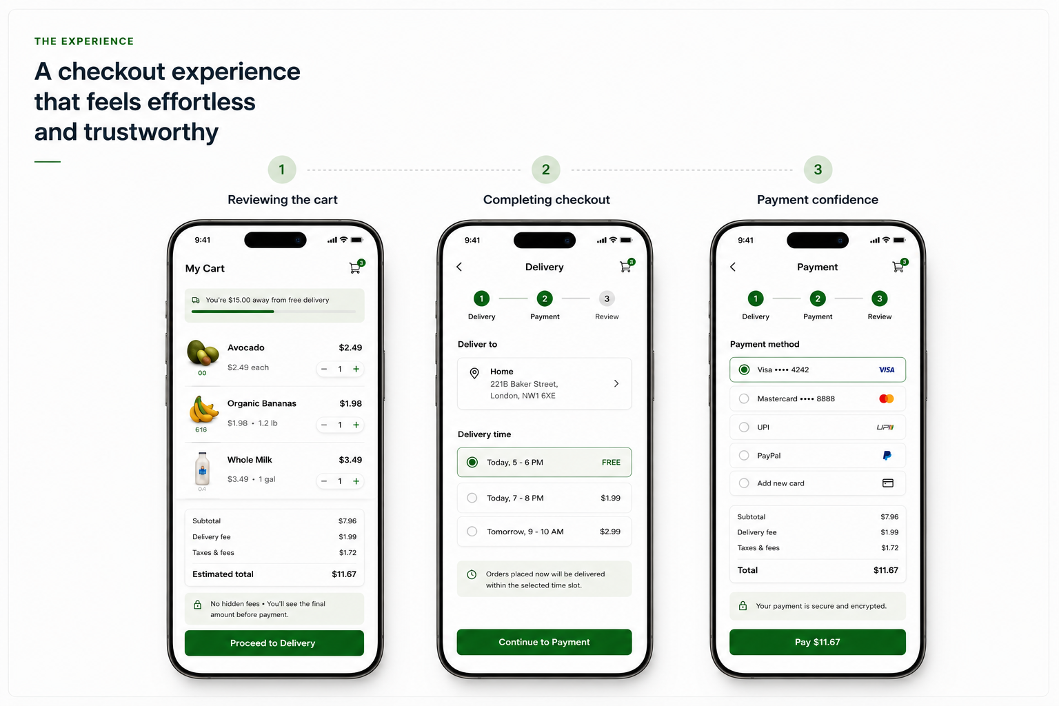
The high-fidelity screens take the shopper through Cart Summary, Delivery Selection, Secure Payment, and Order Confirmation. The cart exposes the estimate and fee breakdown. The delivery screen shows price and timing together.
The payment screen presents methods alongside a final cost summary and security reassurance. Confirmation makes the result of the purchase, order details, and next actions clear.
A guided flow from review to payment
In the experience walkthrough, the shopper reviews the cart and estimated total, selects a delivery time, and proceeds to a payment screen with clear totals and methods.
The emphasis is on confidence before commitment: users know the costs and steps before placing an order, without waiting until the final screen to discover important information.
Small changes can have a meaningful impact
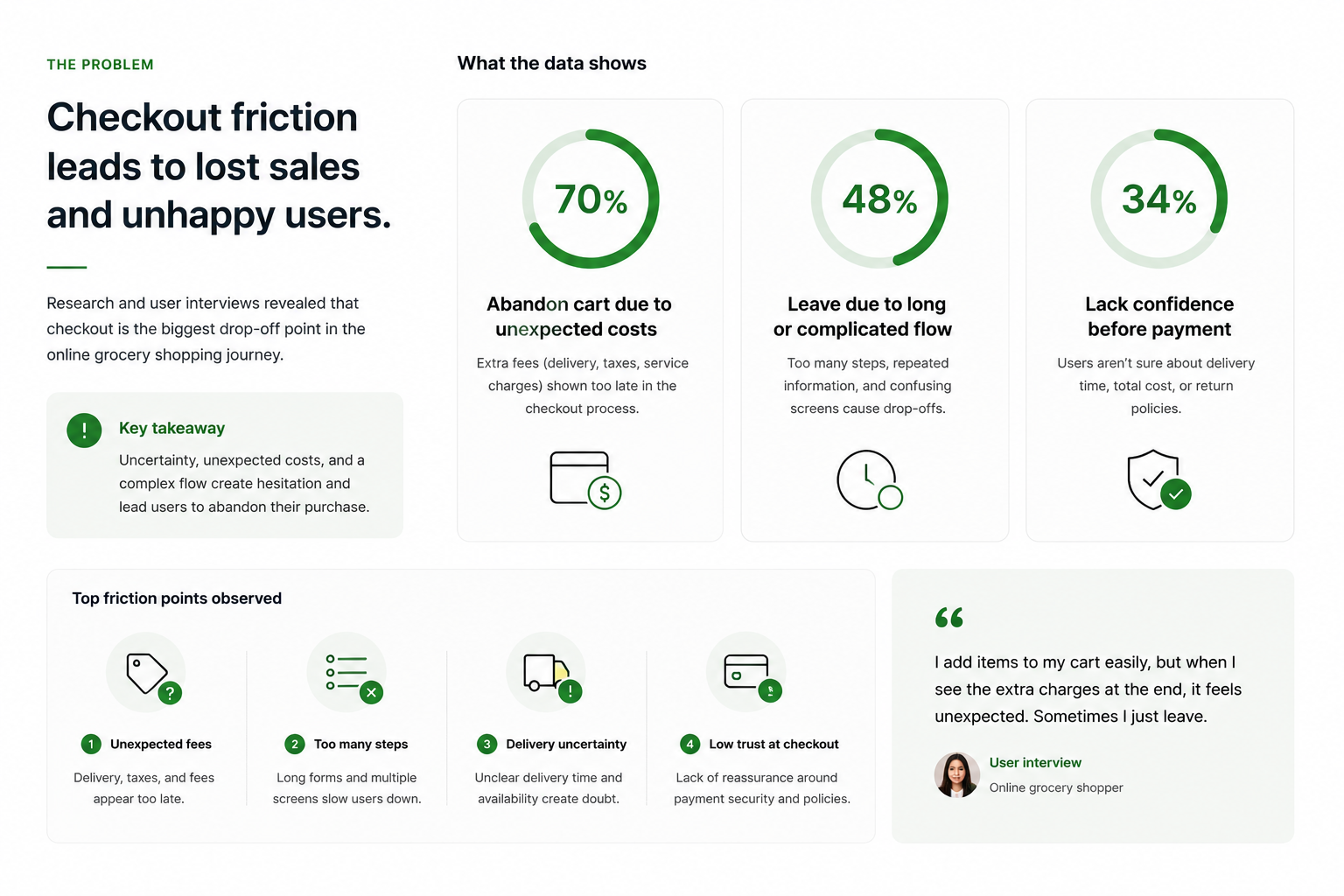
The original outcome board reports a 32% decrease in checkout hesitation, a 41% increase in user confidence, and a 28% increase in completion clarity. It attributes the improvements to clearer costs and a more predictable flow.
The original product overview also presents results including a 27% reduction in cart abandonment, an 18% increase in checkout completion, a 4.2/5 confidence rating, and a 24% faster completion time. Before using any of these as externally validated results, the measurement method, baseline, and participant counts should be confirmed.